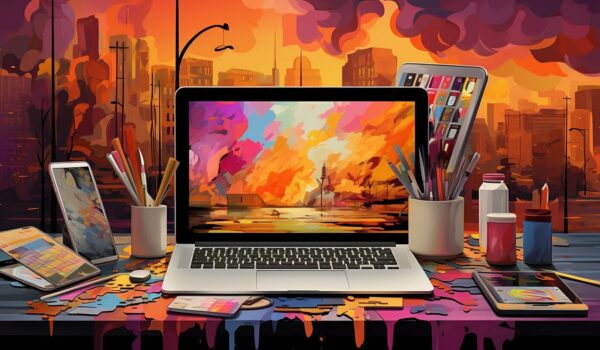
As a college student navigating countless websites and apps daily, I’ve come to realize how visual design shapes our digital experiences in profound ways. From cramming for exams on educational platforms to ordering late-night snacks through food delivery apps, the visual elements we encounter can either make these interactions seamless or frustratingly complex.
Why Visual Design Matters More Than Ever
In today’s digital landscape, users make split-second decisions about whether to stay on a website or bounce. Research shows that it takes only 50 milliseconds for users to form an aesthetic opinion about a website. This first impression is crucial – it can mean the difference between engaging with content or clicking away.
Key Elements of Effective Visual Design
1. Hierarchy and Layout
Visual hierarchy guides users through content naturally, much like how a well-structured textbook leads students through complex topics. By using size, color, and spacing effectively, designers can create clear pathways that help users navigate information effortlessly.
2. Color Psychology
Colors aren’t just about aesthetics – they evoke specific emotions and responses. For instance:
- Blue often conveys trust and professionalism (think LinkedIn)
- Green suggests growth and environmental consciousness
- Red can create urgency or excitement
- White space provides visual breathing room and clarity
3. Typography
Font choices significantly impact readability and user engagement. As someone who’s spent countless hours reading digital textbooks, I can attest that poor typography can make even the most interesting content feel exhausting to consume.
The Connection Between Visual Design and User Behavior
Good visual design isn’t just about making things look pretty – it directly influences how users interact with digital products:
- Reduced Cognitive Load: When elements are thoughtfully arranged, users spend less mental energy figuring out how to navigate and more time engaging with content.
- Increased Trust: Professional visual design signals credibility. Would you trust your banking information to a website that looks like it was designed in the 1990s?
- Better Information Retention: Well-organized visual content helps users remember information better, something particularly important for educational platforms.
Common Visual Design Pitfalls
Through my experience with various digital platforms, I’ve noticed several design mistakes that frequently frustrate users:
- Overcrowded interfaces that overwhelm users
- Poor contrast making text difficult to read
- Inconsistent design elements creating confusion
- Lack of mobile responsiveness
- Unnecessary animations that distract rather than enhance
The Role of Visual Design in Accessibility
An often overlooked aspect of visual design is its crucial role in accessibility. Good visual design should:
- Maintain sufficient color contrast for visually impaired users
- Support screen readers through proper markup
- Provide clear visual cues for interactive elements
- Scale appropriately across different devices and screen sizes
Impact on User Engagement Metrics
The effectiveness of visual design can be measured through various metrics:
- Reduced bounce rates
- Increased time on page
- Higher conversion rates
- Better user satisfaction scores
- Improved task completion rates
Future Trends in Visual Design
As technology evolves, visual design continues to adapt. Some emerging trends include:
- Dark Mode: Reducing eye strain and saving battery life
- Neumorphism: Creating soft, realistic user interfaces
- Minimalism 2.0: Combining simplicity with personality
- Micro-interactions: Adding delightful feedback to user actions
Conclusion
Visual design isn’t just about aesthetics – it’s a fundamental component of user experience that can make or break digital products. As students and future professionals, understanding the importance of visual design helps us become better creators and more discerning users of digital products.
Remember that great visual design often goes unnoticed because it feels natural and intuitive. It’s only when we encounter poor design that we truly appreciate the impact of thoughtful visual design on our daily digital interactions.